I nearly puked when I saw Ford's retro version of the Thunderbird. I was never a real fan of the original, but I could appreciate its design. Then Ford decided to offer this abortion of a car in 2002 to capture the "retro" market.
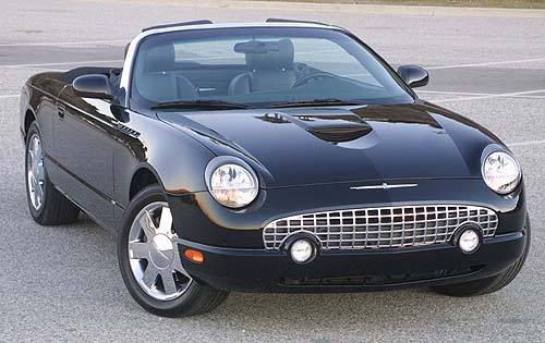
Blech.
The guy who designed that should be made to drive it through Gehenna and back. I guess that's what happens when you have a Canadian design a retro version of an American classic.
Then sometimes a person creates a design that seamlessly transitions a product from our salad days into our gritty, real life present.
My dad had two Datsun Fairlady Zs when I was a kid... a 240z and a 280z I believe, yellow and green respectively.
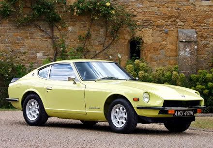
I always loved those cars and when it came time to buy my first car, dad and I both settled on a Nissan 240sx. There was a bit of a family resemblance there, although watered down a bit.
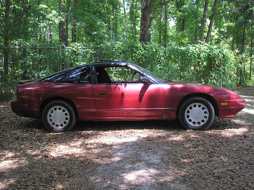
Hell, if I could find one that hadn't been beaten all to hell by drifters, I might buy it. But I digress...
Today I saw something truly beautiful.
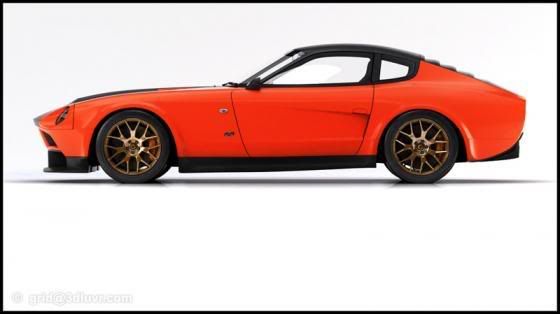
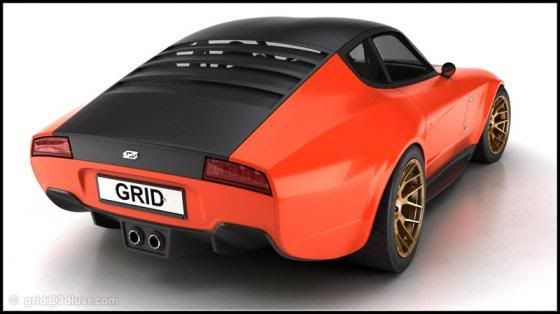
It was designed by Lars Mårtensson on a lark. Just. Because. There's more over at Japanese Nostalgic Car.
Now that, folks, is how you do it. Would that Nissan took notice and hired this guy on.
240sx photo courtesy MonkeyDodge
1 comment:
I don't really go for the panel van look, but I certainly like the HHR better than the anemic PT Cruiser. And everything that I've heared about the SS has been positive.
Post a Comment